Global Access. Redesigning a client research platform so it could take on new products without breaking.
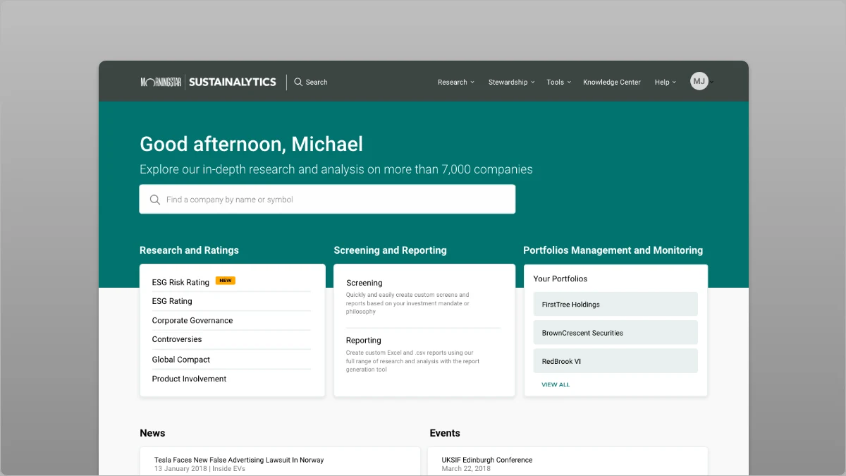
Confidentiality notice
This work predates my time at Dow Jones and is shown as it was presented publicly at the time. Screens come from the design files; client data, commercial details, and internal metrics stay out. The case study focuses on the design problem and how it was solved.
Who
Institutional investors and their analysts, who use Global Access, Sustainalytics' client platform, to find ESG research, ratings, and data on thousands of companies.
Problem
The interface had fallen behind the product. New research products did not fit the navigation, visualizations were basic, exports were limited, and each addition made the platform harder to use.
My role
UX lead. Strategy, research, information architecture, prototyping, and visual design, working with marketing, sales, advisory, technology, and research teams.
Challenge
Global Access was where clients met the company's research every day, and it had been built for a smaller catalogue than it now carried. Three things had to happen at once: modernize the interface without sacrificing the depth analysts depended on, realign the experience to how clients actually worked, and build future-readiness into the platform so new products and services could be added without disrupting the people already using it. The last goal was the hard one. A redesign that only looked better would be out of date at the next product launch.
Strategy
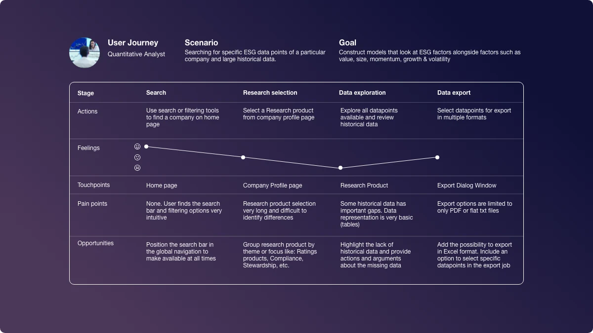
Start from evidence, not opinion. I ran surveys and one-on-one interviews with clients and paired them with two years of Google Analytics interaction data, then turned both into personas and journey maps the whole cross-functional team could work from.
Then fix the structure before the surface. Global and local navigation were rebuilt around new research product categories, so analysts could find a product by what it answers rather than by where it had historically lived. Data visualization and export were treated as the product's core value, not decoration. And the interface was built as a modular system: reusable components, a flexible grid, progressive disclosure, and entitlement-aware surfaces, so the next product could arrive as a module rather than a rebuild.
What the research showed
Results
The redesign shipped as a coherent platform rather than a set of pages. Navigation was measurably more efficient in usability testing, and persona-tailored surfaces raised satisfaction and engagement in the feedback we gathered from internal and external users throughout the build.
The structural bet paid off after launch. The modular framework let the team add products and respond to feedback without disrupting the experience, and the platform was reported at the time to have improved retention and analyst productivity. Specific figures were internal and are not reproduced here.
The story
The easy version of this project was a visual refresh. The company had a strong new brand, and the platform did not reflect it. But the interviews kept surfacing the same thing: analysts could not find products they were paying for, could not read the data the way they needed to, and could not get it out into their own models. The interface was not the problem. It was the symptom.
The first move was to rebuild the architecture around research products. Two years of analytics showed where people went and where they gave up; the interviews explained why. The new global and local navigation grouped products by the question they answer, so a company page carries its ratings, controversies, and compliance research in one predictable structure.
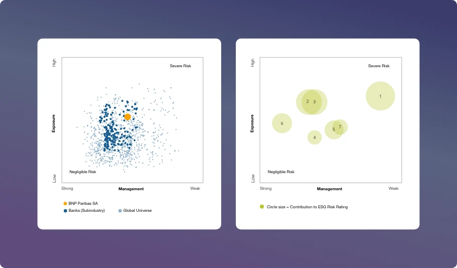
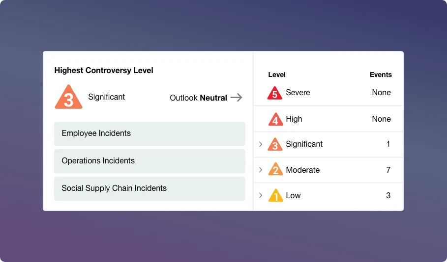
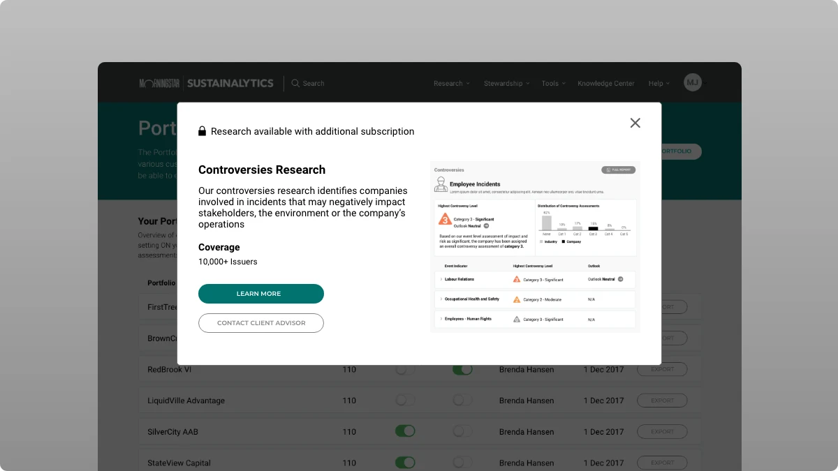
The second move was to treat visualization and export as the product. Sustainalytics sells data; a platform that shows it badly undersells it. We redesigned the core views, risk against management, incident history over time and place, controversy levels with their event counts, so a finding could be read at a glance and then taken into an analyst's own workflow through richer export options.
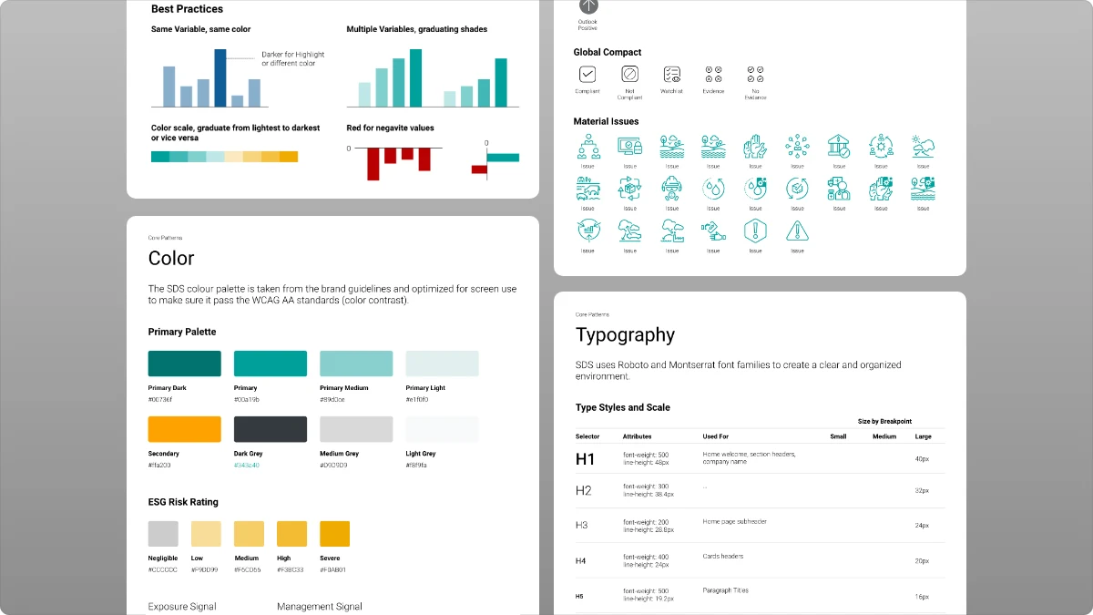
The third move was the one that made the platform future-ready: a minimalist design system of reusable components, with white space and progressive disclosure doing the work that dense chrome used to do, and entitlement-aware surfaces that could introduce a product a client did not yet have without getting in the way of the ones they did. Feature flags let new capabilities roll out gradually, on feedback.
Usability testing ran through the whole process, with internal and external users, and the feedback loop was what kept the three goals from pulling against each other. Modern, realigned, and future-ready were not three projects. They were one system, checked against real analysts at every step.
Select highlights
- Led the redesign of Global Access, Sustainalytics' primary client-facing research platform, from research through visual design.
- Grounded the work in interviews, surveys, and two years of analytics, turned into personas and journey maps the whole team used.
- Rebuilt global and local navigation around research product categories, so products are found by the question they answer.
- Redesigned the core ESG data visualizations and exports, treating the data as the product rather than decoration.
- Built a modular design system with progressive disclosure and entitlement-aware surfaces, so new products ship as modules, not rebuilds.
- Kept usability testing running with internal and external users throughout, so the three goals stayed one system.