Sustainalytics’ ESG Risk Rating
Creating the experience for a new flagship rating product
UX strategy | User research | Ideation & prototyping | Visual design
This case study delves into the user-centric design journey behind Sustainalytics’ ESG Risk Rating, understanding the challenges faced by modern investors, and how this product rose to the occasion, bridging the ESG Risk knowledge gap and becoming an essential reference for sustainable and informed investment strategies.
Project goals
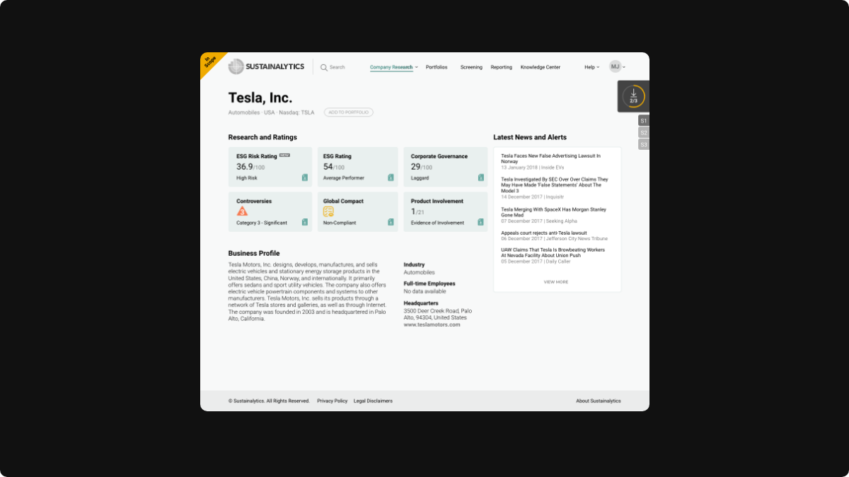
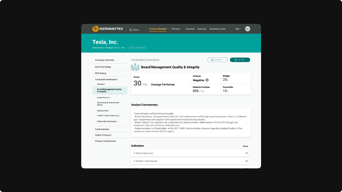
Create a UX strategy for the introduction of a new rating into the family of existing products for both internal and client-facing platforms.
Provide research methodologies to help understand our target audience’s needs, such as surveys, interviews, and competitor analyses.
Develop a visual system that helps understand a multi-dimensional ESG risk rating architecture that combines exposure and management concepts.
Enhance through usability testing and integrate user feedback to refine and optimize the experience.
Support development teams during the implementation phases.
Process
Following a comprehensive UX process we started by partnering with the methodology, advisory, and sales teams to conduct surveys and 1:1 interviews with key clients with the goal to gather in-depth insights, understand their needs, and motivations in relation to what a modern ESG risk rating should provide.
Definition of primary and secondary users, their needs, and pain points through personas and user journeys.
After these qualitative and quantitative exercises, we facilitated a Design Sprint with key stakeholders to accelerate the overall creation of the product and reduce the risk when bringing something so new to the market.
Ideation and Concept Development
With clear experience goals defined and direction established in the design sprint the team moved into advanced design exploration.
We focused in 3 main areas: Data availability, Narrative, and Data visualization.
Using a feedback loop between designers, researchers, business partners, and lead developers, the best designs were in constant iteration until a general consensus was reached on what was the best option for first release.
The last design is checked for full compliance with Sustainalytics Design System and Accessibility guidelines.


Implementation
Design Challenges
This new rating presented a departure from the simple ESG rating used in the market by many companies.
Balancing simplicity with depth and comprehensive data required finding the sweet spot.
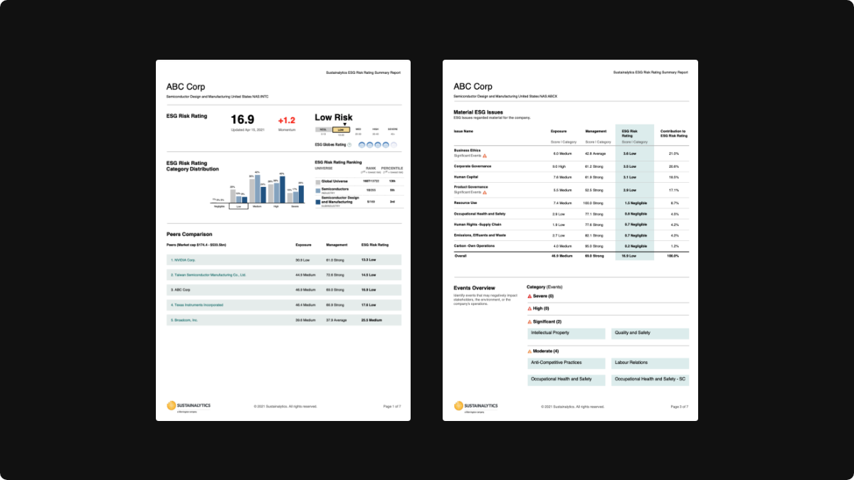
Making a visual system that was adaptable to various platforms and use cases: Online platform, PDF/XLS reports, Portfolio reports.
Solutions and Implementation
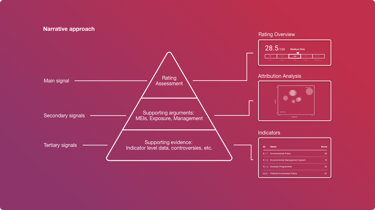
“Pyramid of communication” approach where the information flow goes from the top (tip of pyramid) being the main rating all the way to the bottom with more detail information.
New design elements were created and added to our design system in order to keep consistency when using them by any department in the company.
A five risk levels categories were introduced to help contextualize the main score.
A Waterfall chart was introduced to help explain the relation between the building blocks of the rating in a simple and straightforward way. This Risk Decomposition Chart became the preferred way of explaining the rating to clients by the sales team.


Testing and Feedback
After additional rounds of usability testing, it was identified that there was a need for more simplification in specific areas of the narrative
Results and Impact
Overall adoption was a success with more than 32% of our clients adopting the new rating in the first 6 months of release.
General positive feedback from the investment community where the new rating was selected for use in multiple scenarios: ESG integration, thematic investment, screening and benchmarking, etc.
To this day, the UX design and approach of this product has been the mostly the same, with minimal changes along the way, proving a strong and solid UX process behind.
Thanks for reading!
I'd gladly provide a detailed walkthrough upon request.


