Sustainalytics.com Revamp. One site, two audiences: rebuilding a B2B marketing platform for institutional investors and corporate clients.
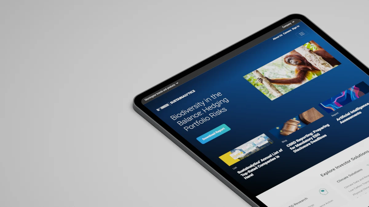
About this project
This work predates my time at Dow Jones. It is here because it is the clearest example of a problem I keep returning to: one platform serving audiences that read the same content differently. Results are from the marketing team's reporting at the time; some visuals are simplified for publication.
Who
Two audiences on one site: institutional investors evaluating ESG research and data, and corporate clients seeking ratings and assessments. Internally, the marketing team and the web technology team.
Problem
Three years after its last major update, a new business unit had been bolted on. The result was fragmented: inconsistent design, confusing navigation, and lead generation that failed to capture or manage business leads.
My role
UX lead. Strategy, research and synthesis, information architecture, prototyping, visual design, and testing, working with marketing leadership and the web tech team through to launch.
Challenge
The site had to serve two audiences with different content needs, navigation habits, and reasons to engage, without compromising the experience for either. Institutional investors wanted to evaluate research and integrate data. Corporate clients wanted to understand their ratings and what an assessment involved. A new business unit had added content of a different shape and complexity, and the architecture had grown around it rather than being designed for it. Navigation confused both groups, the visual language was inconsistent from page to page, and the lead generation flows leaked. The marketing team asked UX for solutions that fixed those gaps and lifted the company's digital presence at the same time.
Strategy
Start from the users, not the pages. Surveys, interviews, and interaction data gave each segment a clear profile, and the information architecture was rebuilt around them: segment-specific entry points from the homepage and throughout the site, so each audience reached its content without passing through the other's.
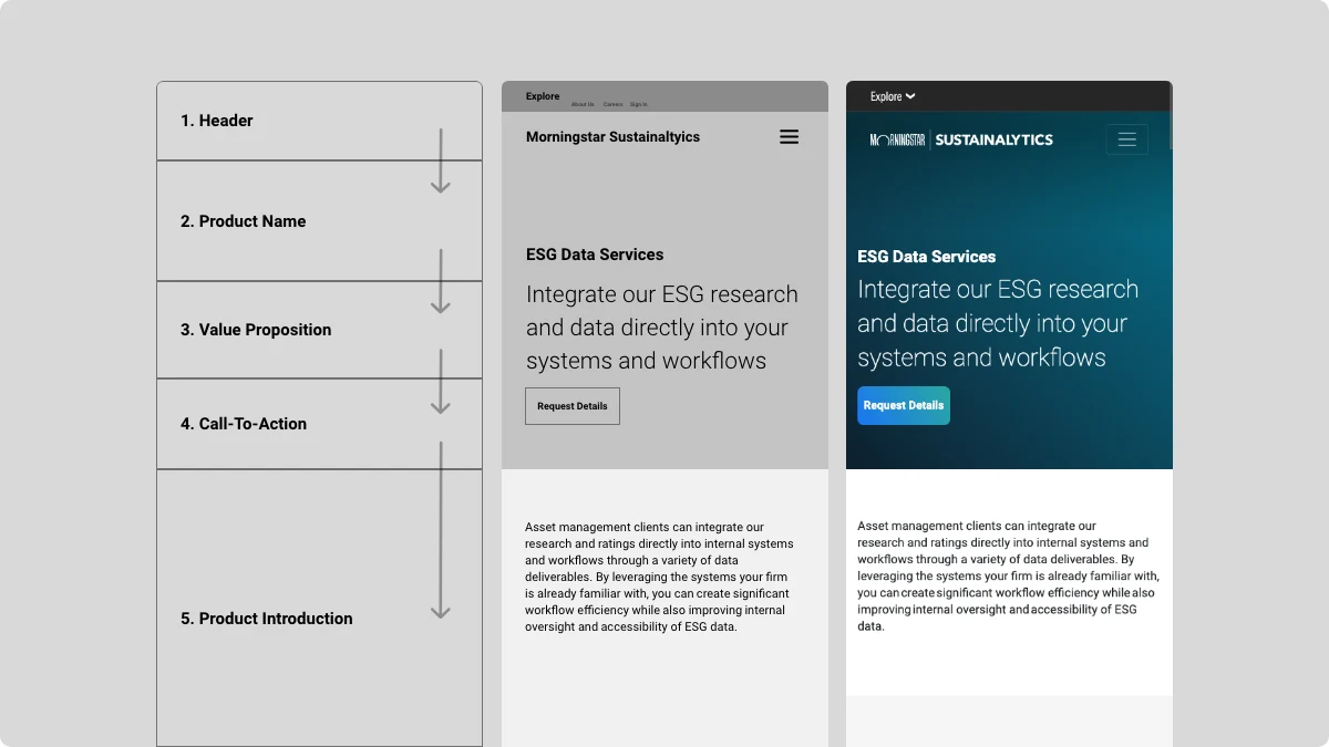
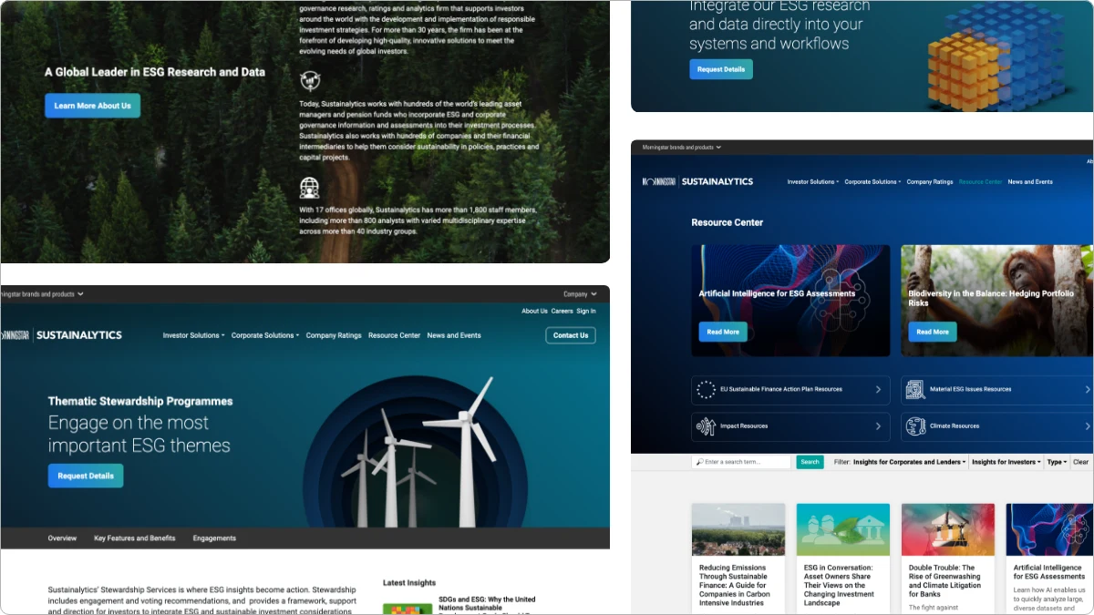
Then standardise the container and vary the content. A unified set of content and visual templates gave every page the same structure and brand voice, while the content inside those templates was written for the audience reading it. To make that hold on mobile, I introduced a content priority guide for every unique page: all of its content broken into items and ranked in text alone, before any layout existed.
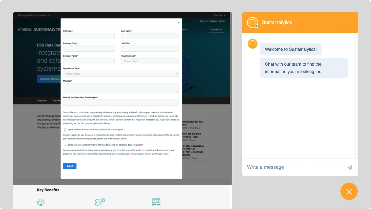
Finally, treat lead generation as interaction design rather than a form at the bottom of the page: dynamic forms, calls to action that respond to user behaviour, and a chat widget, all wired into HubSpot, Eloqua, and Salesforce so a lead was captured and managed, not just collected. Usability tests, A/B tests, and user feedback ran continuously to check that both audiences were being served.
Results
Reception of the new site was strongly positive, with a 45% improvement in user engagement, including longer average sessions and a significant drop in bounce rate. The simplified journeys lifted conversions, which the marketing team tied directly to an uplift in sales. The rebuilt architecture and SEO work raised search rankings and brought a higher volume of organic traffic. The project set the benchmark the company then used for its other digital properties.
The story
The hardest part of this project was not visual. It was that two audiences arrived at the same URL with different questions, and the old site answered neither well. Every decision had to hold for both, which ruled out the usual shortcut of designing for the more valuable segment and letting the other cope.
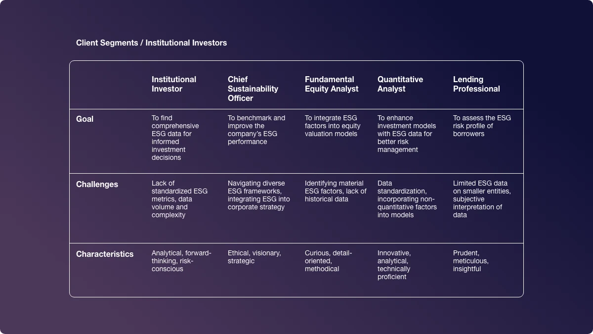
The first move was to give each audience its own path through one architecture. Research produced clear profiles: an investor evaluating ESG data has different goals, obstacles, and habits from a sustainability officer benchmarking a company. The site map put an Investor Solutions branch and a Corporate Solutions branch side by side, with entry points on the homepage and throughout the site that let each reader self-select once and stay on the right track.

The second move was unity without sameness. A coherent set of templates made every page predictable, which is what a brand's identity feels like from the inside. The variety lived in the content. To keep that discipline on mobile, I introduced a content priority guide: for each unique page, every piece of content listed and ranked as plain text before any layout was drawn. It settled arguments about what mattered on a screen, and it made the mobile-first build almost mechanical.
The third move was to treat lead generation as interaction design. Instead of a static form, the site got dynamic forms, calls to action that changed with user behaviour, and a chat widget, each connected to the marketing and sales stack so that a captured lead was also a managed one. That integration, more than any single page, was what turned engagement into revenue.
What the project taught me is the value of holding the whole experience in one frame, navigation through lead capture through content priority, and of running feedback loops continuously rather than at the end. And that none of it works without the people outside the design team: content, marketing, sales, and developers all shaped the result, and the site was better for it.
Select highlights
- Led UX for a full marketing platform rebuild, from strategy and research through visual design and testing.
- Designed segment-specific navigation for institutional investors and corporate clients within one information architecture.
- Established unified content and visual templates that made every page predictable while the content stayed audience-specific.
- Introduced a content priority guide per page: content ranked as text first, driving a mobile-first build.
- Designed lead generation as interaction: dynamic forms, behaviour-aware calls to action, and chat, integrated with HubSpot, Eloqua, and Salesforce.
- Delivered a 45% improvement in engagement, higher conversions, and stronger organic traffic, setting the benchmark for the company's other digital properties.